The Idea
With the word Physical to work off of I decided to craft a story that, in many ways, reflects what I’ve seen happening in my own surroundings growing up. Technology is always evolving, mostly for the better, but sometimes it feels as though it’s at the cost of physical connections.
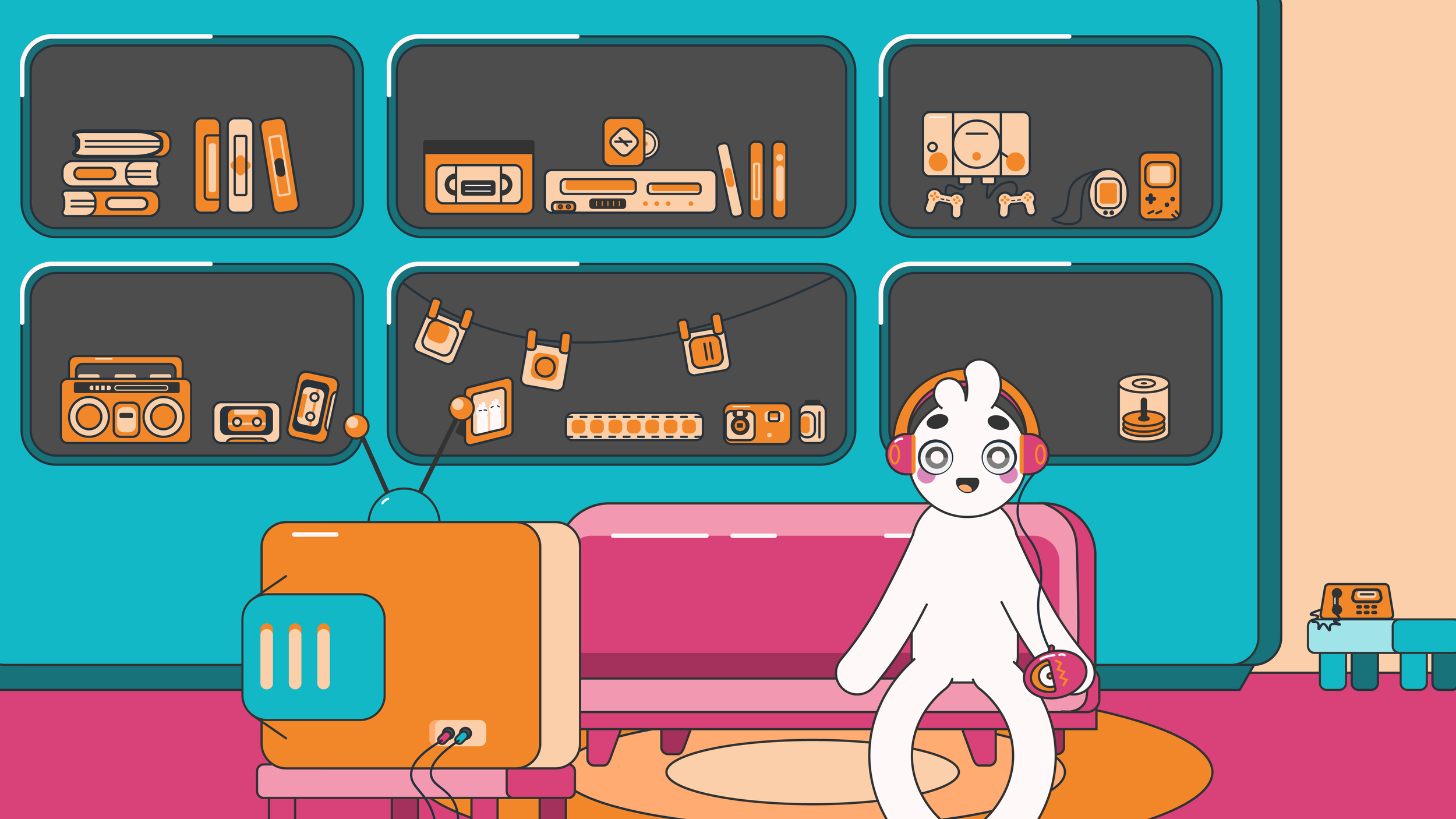
So the overall aesthetic of the story reflects a lot of 90’s nostalgia with the colors and devices, since I was born in the late 90s and slowly evolves into a less colorful and colder environment.

The Characters
When designing the characters I wanted to create ones that would have their own distinct personalities without needing to speak. So that the emotions of the characters would rely on the motion graphics/animation.
The look of the characters are also designed in a way that the viewer could easily put themselves in their spot, hence their mostly blank slate. The colors of the characters are also drawn from my own brand colors.


The Promotion
I also designed promotional flyers that served as both posters before the show and take-aways after the show.


